EPIC WINGS
BEST WINGS FOR 11 YEARS. THE BRAND SYSTEM FINALLY MATCHES THE WINGS.
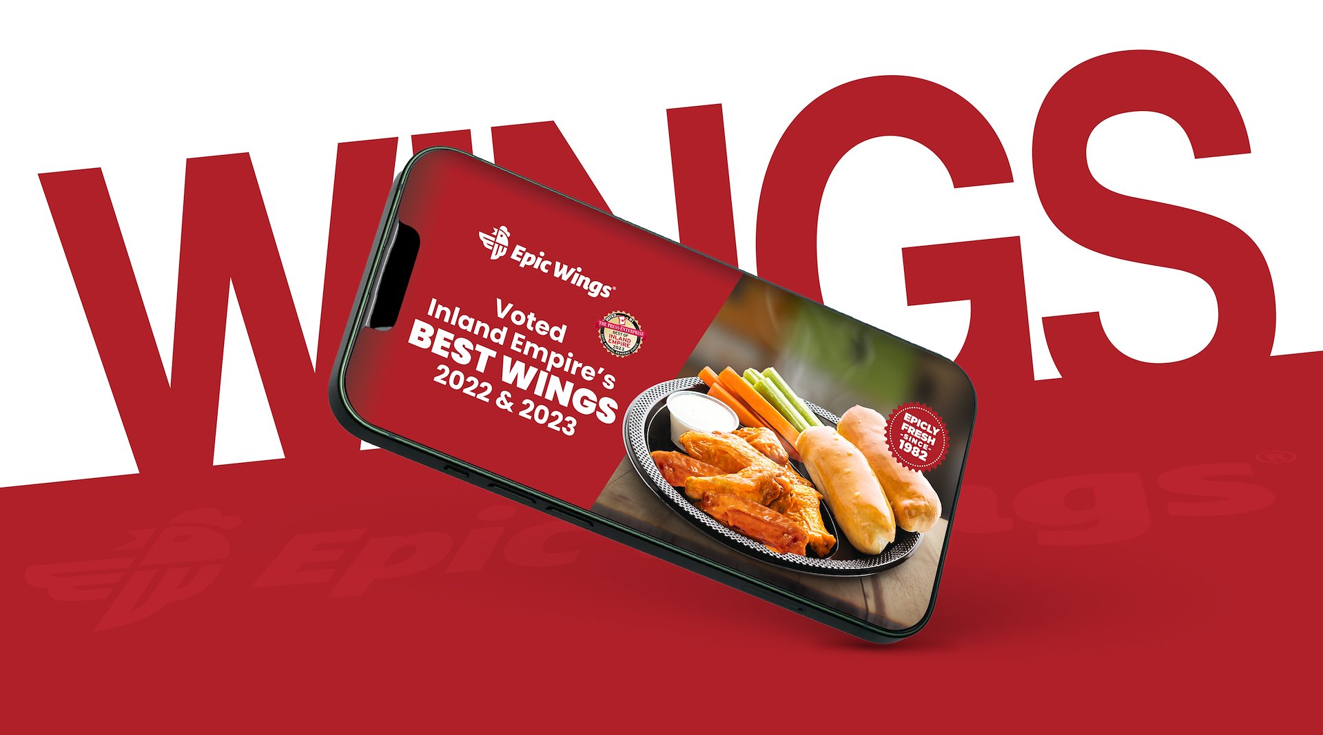
Epic Wings had the product, the loyalty, and the track record. What they needed was a visual system that could hold across every format: packaging, digital, in-store, without fragmenting. Built the full brand architecture: typography system, hierarchy, repeatable layouts.
+18% social engagement. +12% online orders. Consistency sells.
The Challenge
Goal: Elevate Epic Wings’ brand with a bold, cohesive visual identity across campaigns that captures its uncompromising commitment to taste.
Challenges: Translate the brand’s freshness-first philosophy into dynamic digital branding while maintaining consistency across platforms and materials.
Benefits: +18% increase in social media engagement, +12% growth in online orders during campaigns, and stronger brand recall measured in post-campaign surveys (+15%).
A STRUCTURED BRAND SYSTEM
Every element was designed as part of a larger system.
Clear hierarchy, controlled typography and repeatable layouts ensure consistency across packaging, digital and retail, while allowing the brand to scale efficiently.


STRUCTURE / FOUNDATION
The system is built on a strict hierarchy.
Primary messaging, product information and brand elements are organized to be read instantly, both on shelf and on screen.
BEST
WINGS
for 11 YEARS
TYPOGRAPHY AS A SYSTEM
Typography drives the identity.
A controlled set of styles defines rhythm, hierarchy and consistency across all applications, from packaging to digital assets.


FROM CONCEPT
TO ROLLOUT
A system that holds across
every application

CONSISTENCY
Every output follows the same visual logic.
This eliminates fragmentation and strengthens brand recognition over time.

REPEATABLE
LAYOUTS

View the System
How Epic Wings translates across
print, digital and in-store.

A SYSTEM BUILT
TO SCALE
Built to hold across every format
